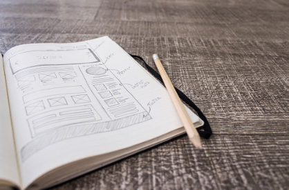
[vc_row][vc_column][vc_column_text]Whether you work in web design or print design, you need to understand the importance of design grid systems. Grids are the invisible structural elements that hold a design together. By applying geometric mathematics to your design you can obtain a certain degree of symmetry and balance to your layout. This is particularly important for websites and typographically heavy print designs like menus where there will be many columns full of text. How you choose to lay out your text is important because it dictates how your viewer’s eye will scan the page, a good designer will actively manipulate how a viewer’s eye will travel through a design (choosing to highlight the most important elements first and navigating to the least) while not drawing attention to the grid itself.
The use of design grid systems has had a resurgence in popularity in recent times. This is something that has developed as the web has matured in to a more flexible and robust design platform. Another reason this has happened is because of the rising use of templates, reusable CSS libraries, and themes across various platforms and interfaces. Most people don’t know what a grid looks like for design or they are not aware of it’s existence because they are not supposed to be. A good designers uses a grid system to lay out text in an engaging fashion while giving the page balance and structural organization. Most college graduates will know all about design grid systems, however for many self-taught web designers, design grid systems are something of a mystery.
Many designers in today’s times have no clue what a grid system is and that’s largely due to the advent of content management systems and CSS libraries which has allowed many web designers to focus on the design aspect. In terms of graphic design, the use of grids is even less prevalent due to the fact that many graphic designers are self-taught Adobe Photoshop users. The main focus when using design grid systems is to create a structural balance in the composition. A sophisticated layout structure offers more flexibility and enhances the visual reading experience of the viewer. In fact, the viewer can easily follow the path developed by the designer because a design grid system offers consistency which creates a better reading experience.
Below we have created a list of techniques you can use to achieve a well designed grid system:
- Always start your design with a layout grid. No Exceptions. One of the easiest ways to ensure your design has a certain degree of balance is to use a design grid system. These systems used to be something proprietary to print design, but due to the relevance of web design, much of same ideology has migrated to the digital medium. Starting with a grid system allows you to have direction and helps you avoid running into problems later on which can cause you to redesign the whole project all over again. It also provides a professional level of consistency and sense of order to your design. This is important because when your page elements have a sense of cohesiveness it puts your reader at ease and facilitates an experience that gives focus to the important stuff.
- Compose your grid like a photograph. When it comes to building a grid many of the same concepts we take into consideration for taking a photograph apply in pretty much the same fashion. Create a focal point, a strong visual can provide a powerful way to lead your reader into your page or design and also provides an anchor point around which to arrange the remaining content. Use the rule of thirds or the golden ratio, divide your page into thirds vertically and horizontally, the points at which the grid lines intersect provide the natural focal points of composition. Use white space, this can be achieved by using a generous amount of margins, gutters, or padding to allow your content to breathe.
- Repeat design elements across your layout. Determine a strong motif or design treatment and apply it across your layout, this will allow many disparate areas to feel connected across your composition. This can also be used to create focal points in your design that you are trying to highlight.
- Use hierarchy in your layout. One of the strongest ways to create a sense of harmony and order in your layout is to create a degree of hierarchy. This can be achieved by special treatment to headlines and focal points that differentiate these elements from the rest of the content. Take a look at your page and determine what elements are most important and then find a way to highlight these elements in a way that helps guide the viewers eye across your layout without taking away from the overall feel of your design.
- Use variance and similarity effectively. Lastly, a great way to achieve visual balance in your layout is by using scale, contrast and harmony effectively. By making particular elements larger or with greater contrast you can guide the viewers eye to these elements first. This will create a more comfortable experience because the reader will look at the important objects first because of the fashion in which they are designed and then at there pace look at the remaining content when necessary. You can use the principle of harmony to make everything feel connected and structured.
[/vc_column_text][/vc_column][/vc_row][vc_row][vc_column][us_sharing type=”fixed” color=”primary” facebook=”1″ twitter=”1″ gplus=”1″][/vc_column][/vc_row]


