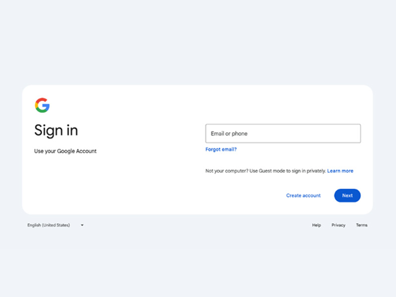
For weeks, Google has been preparing users for the upcoming redesign of its login page, a critical interface utilized by billions daily to access Gmail and numerous google-authenticated websites. This week marks the official rollout of the revamped design, offering users a glimpse of the changes.
Described by the tech giant as a ‘more modern look,’ the redesign aligns with Google’s Material Design 3, a cohesive set of design principles across its services. Characterized by rounded edges, gentle features, and subtle pastel hues familiar from products like Gmail and Android, the new design aims to enhance user experience. Despite the updated appearance, Google assures users that the functionality of the login page remains unchanged.
However, as a web designer, my primary concern is ensuring the roll out does not create opportunities for scammers to trick users in to providing credentials or sensitive information. As a result, we’ve decided to provide a little update on this new design to ensure our customers and the global community can have an idea about what to expect.

In Google’s latest facelift, the login page undergoes a transformative makeover. Bid farewell to the vertical layout as it embraces a sleek horizontal design. Sharp corners soften into gentle curves, while the iconic blue login button morphs into a pill-shaped allure. The once-gray backdrop now gleams in pristine white, offering a canvas for enhanced visual clarity.
But it’s not just about aesthetics. Embracing asymmetry, text and logos find newfound freedom, dancing amidst generous negative space, lending an air of uncluttered sophistication. Yet, amidst these changes, the essence remains intact, ensuring familiarity amid the fresh look.
Google assures a seamless transition for all users, from desktop warriors to mobile mavens, spanning both personal and enterprise domains. The rollout commenced on February 21st, 2024, embarking on a global journey to grace every Google user with its refreshing presence, culminating by March 24th.
Why Is It Taking So Long And Why Have They Warned Us So Much?
In light of the unprecedented amount of cybersecurity threats, it seems that Google is proceeding with caution in implementing their latest update. Users have been duly alerted to the impending changes, receiving warnings well in advance. Remarkably, while Google’s other services underwent a comprehensive overhaul in recent years, the login page remained untouched, underscoring the gravity of security concerns in today’s digital landscape. In our opinion, you can expect a bolstered amount of security and potentially even in new ground-breaking industry-leading innovations in the way user login is authenticated and validated. Stay tuned for additional updates on this emerging story in technology news.
Why Is The Login Page So Important?
While Gmail or YouTube as platforms may boast flashy redesigns, the Google login page stands as the sentinel of trust and a beacon of security in Google’s digital empire and the large percentage of the internet that uses Google to authenticate users. It’s the sacred web domain where users’ faith and authenticity converge, distinguishing the genuine gateway from the lurking shadows of phishing attempts and identity theft. As a web designer, I’m excited to see how the new login page functions because it usually sets the tone for website security across the internet.
 About the author: Miguel Garcia assumes the role of Creative Director at 960 Design, a distinguished California-based web hosting enterprise delivering holistic solutions to a global clientele. With over two decades of technical acumen and a degree in computer science, Garcia’s professional journey spans diverse domains, including IT consultancy, restaurant management, graphic design, and entrepreneurship. Harnessing this extensive background, he offers insightful commentary on technology, small business management, and both traditional and digital marketing within the 960 Design news


