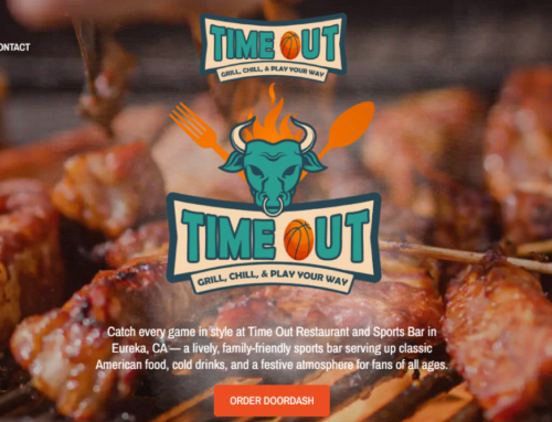
We unexpectedly found ourselves immersed in the restaurant website design realm, driven by a natural evolution of our services. Initially, our aim was to assist clients in enhancing their website’s user experience, streamlining information flow to reduce the need for repetitive explanations from their staff. Our primary goal remains ensuring that the websites we create foster increased engagement, boost reservations, cultivate repeat patronage, and ultimately drive business growth.
Over time, we honed our expertise, devising efficient methods to develop top-notch websites at a fraction of the cost compared to our competitors, all without compromising on quality. If you’re considering a website overhaul, we’re well-equipped to guide you through the process.
Here, we’ve assembled 10 invaluable tips for optimizing restaurant website design. The first five steps concentrate on laying the groundwork for an exceptional user experience, while the latter five focus on leveraging your website as a powerful marketing tool. Throughout our work, we adhere to industry best practices and ethical standards, eschewing shortcuts and exploitative tactics that ultimately undermine effectiveness and detract from the user experience.
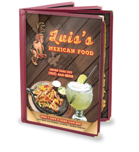 1. Personalize The Design
Creating an effective restaurant website design requires many elements working in symphony but the first step is to take a moment to understand the business. Every time we are initiating a new project we perform some essential research. This fundamental research provides context and cultural insight that will allow us to appropriately design the layout with a conscious approach.
2. Create and Use Mouthwatering Photography
We have created websites for many restaurants and a variety of other businesses. One of the key strategies in great restaurant web design is the ability to use images that adequately convey the food products themselves. As any restaurateur can attest, getting pictures of there entrees in a way that represents how good the food actually is can be very tricky. A great photographer can capture the right photos with ease but in today’s times you don’t need an amazing camera to get quality photos, having an eye for photography is the most important element and understanding simple strategies for better food photography will only improve your restaurant web design.
3. Strengthen Your Online Directory Listings
Creating a successful restaurant business is a hard task in itself but leveraging online directories to help your customers find your restaurant’s website is so easy and important that it should be addressed promptly. After looking up a local business on their smartphones, 61% of users called the business — and 59% of those people walked through the door. An amazing restaurant web design addresses online directory listings and ensures they are consistent across the internet because it enhances your brand and gives a restaurant credibility and search engine domain authority.
4. Create A Mobile-Friendly Layout
There are many features involved in great restaurant web design but addressing mobile-friendly website visitors is crucial in modern times. We implement a “detect and redirect” technology that essentially detects mobile phone website visitors and redirects them to the mobile layout CSS stylesheet. This allows businesses to maintain realistic metrics because users are viewing the same information however the layout is adjusted for the smaller screen size. This creates a consistent look across devices and keeps your metrics organized in a way that makes sense.
 5. Keep It Simple Stupid
We’re not sure if it’s cause of twitter or just the current times we live in but people don’t want to read anything over 140 characters these days. Statistically, we haven’t seen a lot of time spent on text heavy pages so we encourage simplicity in restaurant web design. English teachers will tell writers to convey their message in a concise way and eliminate any redundant adjectives and this is true for websites as well. There is no need to make websites too wordy unless its for informational purposes but in most cases simplicity is key.
6. Eliminate Distracting Elements
Creating a memorable web experience is important but the distracting element of audio causes problems and is typically more annoying than pleasant. Anyone in an office setting that has had music go off and had to quickly hunt down the pause button can relate. Adding music is shunned in web design. In general, we recommend avoiding excessive styling of fonts, menus, navigation, page layouts, etc. The distraction created from highly stylized elements usually leads to poor usability and a general lack of focus.
7. Understand Your Consumer
There are a variety of ways get information about restaurant customers but one of the most effective ways is to measure the online activity of a restaurant’s website. There is enough information to overwhelm the average person but with the right understanding we can extrapolate the important details and visualize emerging patterns. The benefit of this information is that it can glean important insight regarding the effectiveness of marketing campaigns in a way that is quantifiable and measurable.
8. Integrate Your Social Media
In today’s market, your restaurant’s reputation is determined by social media. You need an active and engaged audience of current and potential customers to succeed with social media. We will optimize your social media profiles to look great and engaging. We will cross-promote your restaurant across multiple social media sites to maximize your online exposure. Integration means your site will directly display content and updates from your social media profiles as well as giving your customers links to your social media profiles. This is how social media gets done right!
 9. Optimize Your Restaurant Website’s SEO
We take care of your business with digital marketing solutions, from SEO to PPC and web designs. You’re always in the loop as we alert you of any changes or modifications we’ve made to your website. When you trust us to optimize your online presence, we make sure you’re not disappointed. A complete approach to your digital campaign is put in place. We’ve helped numerous restaurants improve their placement in search results and increase traffic to their website. Reach new customers and start winning online today!
10. Encourage Reservations and Catering with Call-To-Action Buttons
A good restaurant website design will effectively use a call-to-action (CTA) button – this can include an order now, make a reservation, contact us, etc. It is prudent that you have a way to convert your visitors into orders directly by using a flat rate online ordering partner. Other CTA buttons might be “Call Now” which is good to have set up properly for mobile visitors as well as a “Make a Reservation” button if you have a system for that in place. The CTA buttons truly depend on what your business goals are, this is why they will certainly vary from restaurant to restaurant.
Conclusion
When visitors click on your call-to-action button, it’s not just a mere interaction; it’s the gateway to potential leads and customers for your business. Your landing page, promotional banners, sales copy, and PPC ad campaigns all play crucial roles in enticing clicks that can translate into valuable conversions. A robust click-through rate sets the stage for higher conversion rates, provided that all other components, such as your sales funnel and offer, are finely tuned to resonate with your target audience.
However, achieving optimal results requires ongoing refinement. Whether you’re driving traffic from search engines or social media referrals, it’s imperative to continually test your call-to-action messages, copy, and button designs. Merely creating a call to action isn’t sufficient; true insights emerge only through diligent testing of various iterations, revealing what truly resonates and drives action.

